Over time I've sat through a lot of long dull company satisfaction survey presentations or webinars. Yawn.
I've probably been for my fair share of interviews too. Only last week I wrote a piece about using data in compelling ways.
Confused? Lost about where I am going with this one?
Well I've just spotted this nice example of a slightly tongue in cheek recruitment video that is designed to attract candidates to UK ad agency Dare whilst saying something about the company. It combines the output of a company survey (of sorts), has taken the data and created a series of infographics, and combined them to form a short film which I think you'll admit is much more appealing than a dull presentation or a load of facts on a website.
This is Dare. Are you? from thisisdare on Vimeo.
How could you interrogate the data you have around a given topic to create something similar? I came across Gartner's notion of Pattern Based Strategy earlier today and it really resonated: the notion not of purely copying something but learning from the principles or core ingredients to create something repeatable and scaleable. Now that's smart.
Monday, 18 October 2010
Monday, 11 October 2010
Challenging category norms with creativity
In days gone by I worked on the yellow fats and dairy category (that's butter, milk & yoghurt in normal non marketing lingo). I found it hugely ironic at the time, given that I'm allergic to dairy products and don't even really regularly walk down the aisle in the supermarket.
However, I did work on it for long enough to know that unless there was a cow and some broad lush green landscapes in the creative, clients would shout and complain about the lack of wholesome, freshness cues. The category has been stuck in creative stereotypes for years. Yawn.
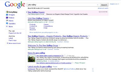
So absolutely full marks to Yeo Valley for taking a fresh approach. Sure, lots of dairy products are traditionally targetted at the stereotypical housewives with children, women 25-54 blah blah, but watch this on YeoTube (pun clearly intended) and then decide for yourself whether an edgy approach might have just as much if not more appeal to that audience by taking a different angle.
I might just lead your views a smudge by sharing this tweet....

Love it! Made my Monday morning, even if I can't eat the product.
Nice also to see the loop being closed with some specific brand term created search featured at the end of the video.
Good looking website too, albeit flash heavy, with recipes, games, ringtones to download, the predictable product stuff and some social media signposting.
However, I did work on it for long enough to know that unless there was a cow and some broad lush green landscapes in the creative, clients would shout and complain about the lack of wholesome, freshness cues. The category has been stuck in creative stereotypes for years. Yawn.
So absolutely full marks to Yeo Valley for taking a fresh approach. Sure, lots of dairy products are traditionally targetted at the stereotypical housewives with children, women 25-54 blah blah, but watch this on YeoTube (pun clearly intended) and then decide for yourself whether an edgy approach might have just as much if not more appeal to that audience by taking a different angle.
I might just lead your views a smudge by sharing this tweet....

Love it! Made my Monday morning, even if I can't eat the product.
Nice also to see the loop being closed with some specific brand term created search featured at the end of the video.

Good looking website too, albeit flash heavy, with recipes, games, ringtones to download, the predictable product stuff and some social media signposting.
Friday, 8 October 2010
Google Doodle gets video for John Lennon's Would-be 70th
Look carefully at the Google doodle today and you'll notice a "play" icon...
 Which being permanently curious I obviously clicked on...to find a short animation to the soundtrack of "Imagine"

First time I've seen video embedding / linking with a Google Doodle. Quirky & fun.


First time I've seen video embedding / linking with a Google Doodle. Quirky & fun.
Visual Inspiration: Turning data into compelling information
I'l nail my colours to the mast and say that I believe that data visualisation is something we are going to see more and more experimentation with, in more and more multi-media forms.
If you look at some of the things that most frequently whizz around the web creating conversation, infographics are right up there. The world is awash with data and this isn't going to change, as more and more things are connected together and creating a constant flow of data creation (living as we increasingly do in a world of internet of things). Data that can then be modelled and translated into interesting and easy ways to make that data easy to understand.
I'm a big fan of the work of Flowtown who amongst many wonderful things recently updated their social map of the web / world

and Information is Beautiful, and their book of the same name.
I'm increasingly seeing more and more tools that pull data from different sources to creating (aggregated) visual representations. I'm hoping I'm going to get an invite to Storify which just launched in beta.
Spezify remains my favourite living mood board tool, last week I found some nice visual search tools that represented image / associated tag results in interesting ways, and then you've got the likes of US auto manufacturer Buick and the Grammy (music) Awards who are using Spezify-esque approaches to aggregate information around given topics from a variety of multi-media sources e.g Twitter, YouTube & Flickr amongst others.
Do go and have a play with both, and think about both the information, the way it's delivered and the experience it offers.We'd give the Grammy's more points if they hadn't hidden the Fanbuzz Visualiser at the bottom, & had to close the window to go back to the site. Here's a screen grab showing a nice representation of the conversation volume today about the various nominated artists.

"But I have enough problems creating graphs in Powerpoint or Excel" I hear you cry...
Well maybe, but all this data manipulation is going to get easier... just as being a photographer used to be a skill of the few that has now passed into the hands of many, the same will apply. Microsoft are already developing tools that will facilitate more visual data manipulation. Check out Pivot (video requires installation of Silverlight if you don't have it already).
I expect more and more brands to be using data visualisation techniques to create conversation starters. Have a think, what could your brand apply the principles to?
Singing Fingers App: creativity via bringing music to drawing
It's Friday, so there's a little fun and frivolity permitted. My friend Drew just flagged this to me. Sure, it has novelty & gimmick value, but it's a fun free app, which I imagine with more drawing ability than I possess could actually be turned into something pretty impressive.
Thursday, 7 October 2010
Orange Tweetagrams
So in the week that Orange and T-Mobile officially become everything everywhere (aka as the worst piece of branding positioning ever IMHO), Orange have been having some social media fun with a respond with a tweet or "twoem" (tweet + poem) competition to have your message sung acapella.
The activity closes today so get creative quick and tag your tweet #singingtweetagram and if it's selected they'll record it for you. If you are too lazy to bother, do at least swing by and check some of the ones that have been sung already. Rather fun.

The activity closes today so get creative quick and tag your tweet #singingtweetagram and if it's selected they'll record it for you. If you are too lazy to bother, do at least swing by and check some of the ones that have been sung already. Rather fun.

Virgin Atlantic's feelgood ads
Virgin Atlantic are well and truly my favourite airline. In my globe-trotting days I used to move meetings to ensure I could travel with them. As a gold card holder they really did make me feel special. These days I'm proud to have been down-graded to red card status, it's an exclusive club, the few of us that have seen the light and given up on the work travel drug, the up in the air status, the different restaurant / hotel every night lifestyle. But if I'm travelling long haul for pleasure, they are still my first choice.Unequivocally. They are also my first thought if I'm looking for internal flights in Australia with their Virgin Blue sub-brand and I' happily use a Virgin Atlantic Amex.
So whilst I am shamelessly plugging, here's their new ad
I found it via the recommendation in my newsfeed of a friend on Facebook. Much as I love Virgin, in comparison with Aleksandr Orlov and Compare the Meerkat/market, Virgin could learn a thing or too about communicating new content with their eCRM / fanbase. Facebook yes, it was there but the Facebook algorithm means I missed it / it didn't appear in my newsfeed, I follow@RichardBranson on Twitter but missed the tweet, e-Mail? Nada. But anyway, back to Virgin, and just because I really enjoyed their 25 years old ad from last spring too, I'll add that for your viewing pleasure.
Whether you are a Virgin Atlantic traveller or not I'm sure you'll agree they make you smile. Great soundtracks really help. Are you thinking enough about your non-visual cues?
Earlier in the week I tripped over a fun competition for Virgin America: They've teamed up with the Awkward Family Photo site (well worth a lunchtime visit every now and then) to run an Awkward Family Vacation Photo Competition. Do go and have a look, there are some great submissions....

Monday, 4 October 2010
Timing, Tube strikes & Pizza treats: Relevancy & Context win.
Tube strikes & rain are a bad combination.
But top marks to Pizza Express for demonstrating their ability to be agile, timely and relevant.
I've just had an email with a link to their "not on strike" voucher for 50% off your food bill if you eat in their restaurants today having battled with the transport system (or not as the case maybe). (Actually if you read the small print, it's valid at any restaurant inside the M25, which is pretty smart given that there's probably a lot of people working at home today who might treat themselves to lunch out on a grey damp autumnal day. Smart too that they specify that the voucher is valid if printed or shown on your phone screen too.).
Nice touch. Nice play on the Tube & Pizza Express logo too. Nice timing, just as my thoughts were starting to turn lunch-wards.

Friday, 1 October 2010
Are you guilty of using too many digital buzzwords?
Irreverent and funny but like most of these things there's a grain of truth behind the jokes. Treat yourself, it's Friday.
Subscribe to:
Posts (Atom)


